Data visualization
A version of this material is available as an interactive Jupyter notebook here.
The main purpose of Whitebox Workflows is spatial data analysis. However, every data scientist eventually needs to visualize the data that they produce. The whitebox_workflows.show function allows users to visualize Whitebox Workflows data, including Raster, Vector and Lidar data types, with high-quality interactive plots by leveraging the powerful matplotlib Python library.
Note: The
whitebox_workflows.showfunction requires matplotlib. If it is not already installed, WbW will automaticaly install the library using pip.
The following table describes each of the parameters used in this powerful function.
| Parameter | Data Type | Optional | Description |
|---|---|---|---|
obj | Raster, Vector, or Lidar | required | Dataset to be displayed on the plot axes. Can be of Raster, Vector or Lidar type. |
ax | matplotlib.axes.Axes | optional | Axes to plot on, otherwise uses current axes. |
title | str or dict | optional | Either a string representing the title for the figure, or a dict containing keyword and value pairs sent to the matplotlib.axes.Axes.set_title function, e.g. title='My Title' title={'label': 'My Title', 'pad': 12, 'fontsize': 10, 'fontweight': 'bold', 'fontstyle': 'italic'} |
figsize | Tuple[float, float] | optional | Defines the size of the figure to which the Axes is to be added. |
skip | int | optional | Determines the stride for reading Raster and Lidar obj types when displaying. skip=1 indicates that every pixel/point is read, while skip=2 would indicate that every second pixel/point is read. This argument can strongly impact the amount of time required to display the resulting figure but larger values may impact the quality of the resulting image. For larger raster images, values in the range of 2-10 may be advisable while for lidar datasets, values in the range of 500-1000 may be suitable. |
clip_percent | float or Tuple[float, float] | optional | Continuous Raster datasets (i.e. non-RGB images) will use the Raster.configs.display_min and Raster.configs.display_max values to determine the assignment of colours from the colormap. By default, these values are set to the raster min/max values when the raster is read. If a clip_percent value > 0 is provided, the show function will call the Raster.clip_display_min_max function to clip the tails of the raster histogram. Seperate clip percentages can also be provided for the lower and upper tails respectively as a tuple of floats. Depending on the size of the raster, this function can significantly increase time to display. If the same raster is being added to multiple Axes in a multi-part figure, it may be advisable to only set the clip_percent function (or call the clip_display_min_max seperately) one time.plot_as_surface |
vert_exaggeration | float | optional | This optional argument determines the vertical exaggeration used in displaying 3D plots for either rasters (plotted with plot_as_surface=True) and Lidar datasets. Generally, vert_exaggeration > 1.0 is advisable and for lower-relief sites, values much larger than 1.0 are likely suitable otherwise the resulting plot may appear quite flat. |
colorbar_kwargs | key-value pairings | optional | Dictionary of key-value pairs that are sent to the matplotlib.pyplot.colorbar function. These arguments are only used when a cmap key exists in the **kwargs argument. That is, leaving this argument unspecified will result in no colorbar being displayed in the resulting image. ax = show(hs, title='Hillshade', skip=2, cmap='gray', colorbar_kwargs={'location': "right", 'shrink': 0.5}, figsize=(7.0,4.7)) |
**kwargs | key, value pairings | optional | These will be passed to the matplotlib.pyplot.scatter, matplotlib.pyplot.fill, matplotlib.pyplot.imshow, or mpl_toolkits.mplot3d.axes3d.Axes3D.plot_surface functions depending on obj type. |
The whitebox_workflows.show function returns a matplotlib.axes.Axes.
A basic example
Here is a basic example of the usage of the whitebox_workflows.show function, in which we download a sample satellite image data set, combine multiple layers into a colour composite image, and finally use whitebox_workflows.show to plot the resulting image:
# Basic whitebox_workflows.show example
from whitebox_workflows import download_sample_data, show, WbEnvironment

wbe = WbEnvironment()
wbe.working_directory = download_sample_data('Guelph_landsat')

swir2, swir1, red = wbe.read_rasters('band7.tif', 'band6.tif', 'band4.tif')
image = wbe.create_colour_composite(swir2, swir1, red)

show(image, figsize=(8, 8))
This is the image produced by the above script:

Adding multiple layers to a plot
In the basic example above, we simply called the whitebox_workflows.show function, specifying the data layer that we wanted to display and the desired figure size. Notice that we did not assign the output of the function to a variable. The whitebox_workflows.show takes an optional matplotlib.axes.Axes as an input (ax argument) and similarly outputs an Axes as well. If we don't specify the ax argument, then the whitebox_workflows.show function will create its own instance of a matplotlib.axes.Axes to plot the data to. However, we can use this characteristic of the function to repeatedly add new layers to an existing plot. The following script is a more advanced example that takes advantage of this feature to create a map with several layers, including both raster and vector data layers:
# Advanced whitebox_workflows.show example
from whitebox_workflows import download_sample_data, show, WbEnvironment, WbPalette
import matplotlib.pyplot as plt

wbe = WbEnvironment()
wbe.working_directory = download_sample_data('mill_brook_dem')

# Read in some files
dem = wbe.read_raster('dem.tif')
streams = wbe.read_vector('streams.shp')
watershed = wbe.read_vector('watershed.shp')
outlet = wbe.read_vector('outlet.shp')
contours = wbe.read_vector('contours.shp')

# Create a hillshade image from the DEM
hillshade = wbe.hillshade(dem)

# Let's make a pretty map with many layers
fig, ax = plt.subplots()

ax = show(dem, ax=ax, title='Mill Brook Catchment', cmap=WbPalette.Earthtones, clip_percent=0.0, figsize=(10,7), skip=2, colorbar_kwargs={'label': 'Elevation (m)', 'location': "right", 'shrink': 0.5}, zorder=1)
ax = show(hillshade, ax=ax, cmap='grey', clip_percent=10.0, skip=2, alpha=0.15, zorder=2)
ax = show(contours, ax=ax, color=(0.447, 0.306, 0.173), linewidth=0.25, label='contour', zorder=3)
ax = show(watershed, ax=ax, color=(1.0, 1.0, 1.0, 0.3), edgecolor=(0.3, 0.3, 0.3, 0.5), linewidth=1.0, label='watershed', zorder=4)
ax = show(streams, ax=ax, color='dodgerblue', linewidth=0.75, label='streams', zorder=5)
ax = show(outlet, ax=ax, marker='^', s=43, color=(1.0, 0.0, 0.0), linewidth=1.75, label='outlet point', zorder=6)

# set axes range
ax.set_xlim([dem.configs.west, dem.configs.east])
ax.set_ylim([dem.configs.south, dem.configs.north])

ax.legend()

plt.show()

Notice that the hillshade raster has been transparently overlayed on top of the DEM in each of the subplots. The call to ax.legend() adds a legend box for each of the vector data layers. You may use the full matplotlib API to adjust individual plot features such as the placement of the legend box, fonts, etc.
Colour palettes
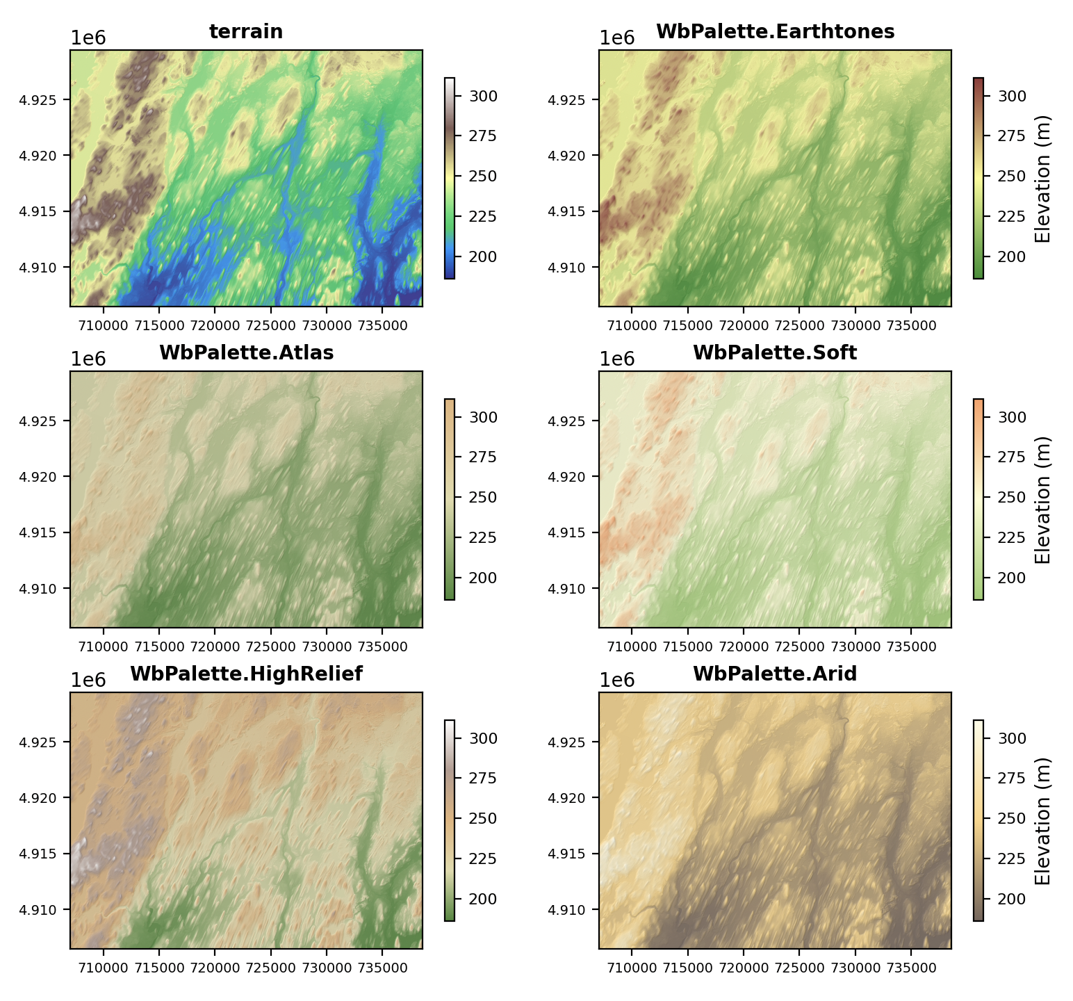
The cmap argument determines which colour palette (or colormap in the language of matplotlib) is used to render continuous raster images, such as digital elevation models (DEMs), and Lidar data sets. Users may select any of the matplotlib standard colormaps or any of the Whitebox palettes contained within the WbPalette class.
For example, the following script renders a DEM using a range of terrain-specific palettes.
# cmap example with multiple subplots
from whitebox_workflows import download_sample_data, show, WbEnvironment, WbPalette
import matplotlib.pyplot as plt

wbe = WbEnvironment()
wbe.working_directory = download_sample_data('peterborough_drumlins')

dem = wbe.read_raster('peterborough_drumlins.tif')
hillshade = wbe.hillshade(dem)
hillshade.clip_display_min_max(2.0)

rows = 3
columns = 2
fig, ax = plt.subplots(rows, columns)
fig.set_size_inches(9.0, 8.5)

# Notice 'terrain' is a standard matplotlib colormap while the other listed palettes are standard to Whitebox.
# Each of the following are particularly well suited to rendering elevation data.
colormaps = ['terrain', WbPalette.Earthtones, WbPalette.Atlas, WbPalette.Soft, WbPalette.HighRelief, WbPalette.Arid]
i = 0
for r in range(rows):
    for c in range(columns):
        if c < columns-1:
            ax[r,c] = show(dem, title={'label': colormaps[i], 'fontsize': 10, 'fontweight': 'bold'}, ax=ax[r,c], cmap=colormaps[i], skip=2, colorbar_kwargs={'location': 'right', 'shrink': 0.75})
        else:
            ax[r,c] = show(dem, title={'label': colormaps[i], 'fontsize': 10, 'fontweight': 'bold'}, ax=ax[r,c], cmap=colormaps[i], skip=2, colorbar_kwargs={'location': "right",  'shrink': 0.75, 'label': 'Elevation (m)'})

        ax[r,c] = show(hillshade, ax=ax[r,c], cmap='grey', skip=2, alpha=0.15)
        ax[r,c].tick_params(axis='both', labelsize=7)
        im = ax[r,c].images
        cb = im[0].colorbar
        cb.ax.tick_params(labelsize=8)
        i+=1

plt.show()

3D surface plots
The whitebox_workflows.show function can also be used to create interactive 3D surface plots from raster DEMs by setting the plot_as_surface argument to True and specifying an obj that is a continuous raster data type. For example:
# 3D surface plots example
from whitebox_workflows import download_sample_data, show, WbEnvironment, WbPalette

wbe = WbEnvironment()
wbe.working_directory = download_sample_data('mill_brook_dem')

dem = wbe.read_raster('dem.tif')
show(
    dem,
    figsize=(10,8),
    skip=2,
    plot_as_surface=True,
    vert_exaggeration = 2.5,
    color='lightgreen',
    shade=True,
    linewidth=0.0,
    rcount=175, # default is 50 rows and columns for grid
    ccount=175,
    antialiased=False
)

Set the cmap and colorbar_kwargs arguments to render the surface elevations using a palette and add a side color bar.

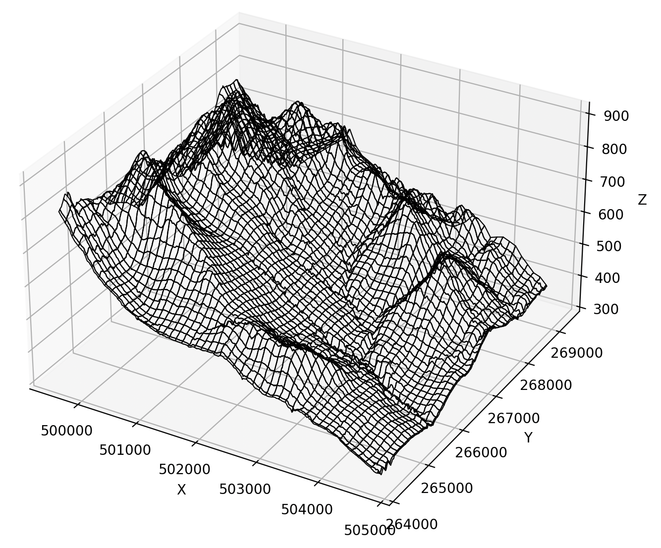
By setting the alpha=0.0 and the edgecolors argument, you can create a wire-frame mesh:
# A mesh grid example
show(dem, plot_as_surface=True, figsize=(10,8), skip=2, vert_exaggeration=5.0, alpha=0.0, linewidth=0.75, edgecolors='black')

Plotting lidar point clouds
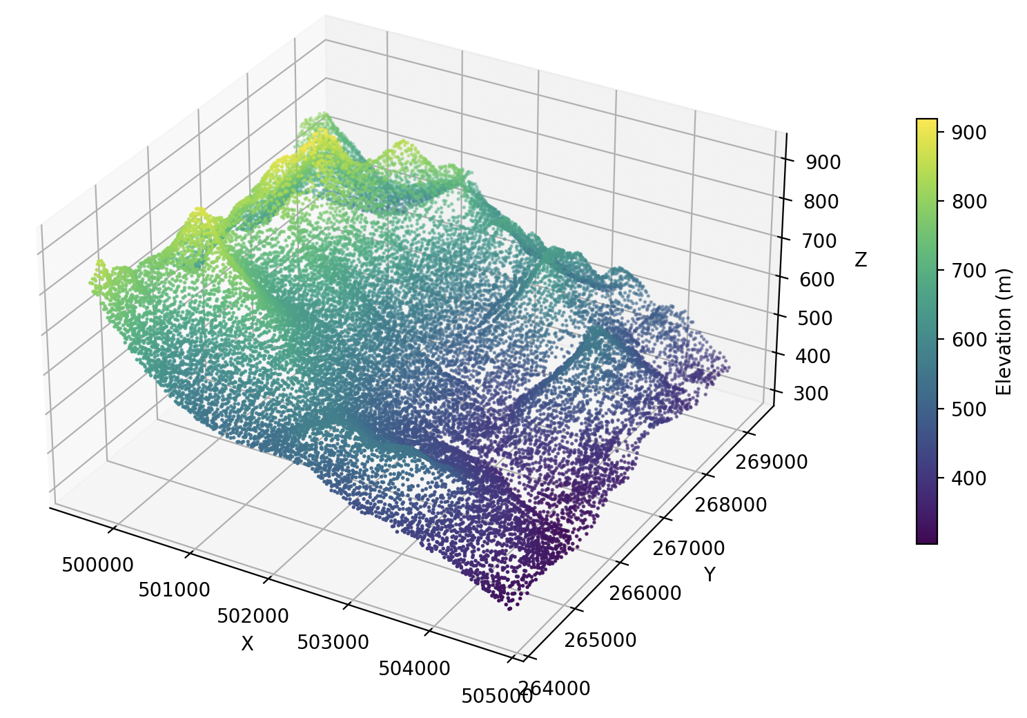
Visualizing lidar data sets works in a similar way to 3D surface plots.
# 3D lidar point cloud example
from whitebox_workflows import download_sample_data, show, WbEnvironment, WbPalette

wbe = WbEnvironment()
wbe.working_directory = download_sample_data('mill_brook')
lidar = wbe.read_lidar('mill_brook.laz')

show(
    lidar,
    figsize=(10,8),
    skip=500,
    vert_exaggeration=5.0,
    marker='o',
    s=1,
    cmap='viridis',
    colorbar_kwargs={'location': 'right',  'shrink': 0.5, 'label': 'Elevation (m)', 'pad': 0.1}
)

If you don't want the axes to be visible, you can change the script so that they are no longer rendered.
# 3D lidar point cloud example with no axes
from whitebox_workflows import download_sample_data, show, WbEnvironment
import matplotlib.pyplot as plt

wbe = WbEnvironment()
wbe.working_directory = download_sample_data('mill_brook')
lidar = wbe.read_lidar('mill_brook.laz')

# Let's create our own custom axes (ax) to pass to the show function
fig = plt.figure()
fig.set_dpi(180.0) # Let's make this figure higher resolution.
ax = fig.add_subplot(1, 1, 1, projection='3d')
ax.set_axis_off() # This line ensures that axes will not be rendered

show(
    lidar,
    ax=ax, # pass our axes here
    figsize=(10,8),
    skip=100, # and plot with higher point density
    vert_exaggeration=5.0,
    marker='o',
    s=0.25, # higher point density might need smaller points
    cmap='viridis',
    colorbar_kwargs={'location': 'right',  'shrink': 0.3, 'label': 'Elevation (m)', 'pad': 0.0}
)

plt.show()
